Interpretation
Antonino Cardillo
The threshold of a house, the opening that unites the inside and the outside, can be likened to the overture of an opera. It gives some glimpses but at the same it doesn't reveal the most important content. In a house with grounds, though, it should not be identified simply as the ‘entrance door’ since the perceptive experiences of the inside and the outside are not separate. At the same time the house and its grounds are two distinct identities that necessarily require heterogeneous constitutional content. Where, then, if not in the passage between these two identities, should we look for the foundation of a new strategy of operation? Conventionally entry to houses takes place via a ‘hole’ (door) in the wall, as in the current pre-existing building. It is a conventional approach, which induces the user to sectorialise the two limits (grounds-building), impoverishing the spatial qualities of both. In the design hypothesis such a passage does not come about by prompt and instantaneous action, like the simple opening of a door, but acquires its own ‘temporal duration‘. That is it is realised substituting the usual concept of the ‘hole in the wall’ for a continuous space, built yes with walls, but one which does not stop the journey, rather it ‘accompanies’ it, creating the aforementioned ‘duration’ of the event. Therefore the same architectonic vocabulary (the wall) which before sectorialised the spaces, with a diverse syntactic function, unites them, translating into reality the primary instance of continuity between the outside (space of the grounds) and the inside (space of the architecture).
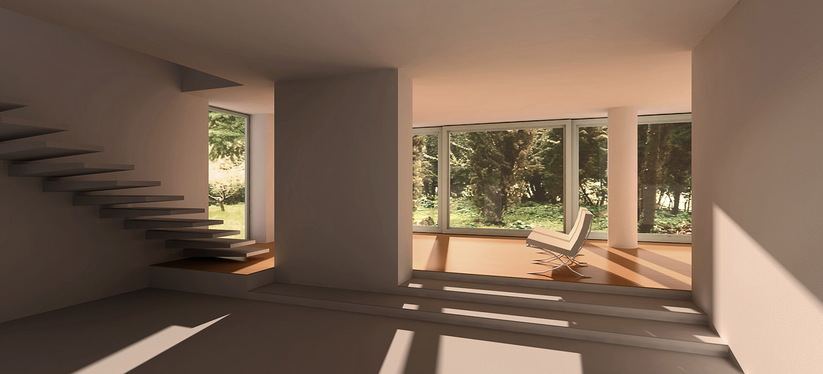
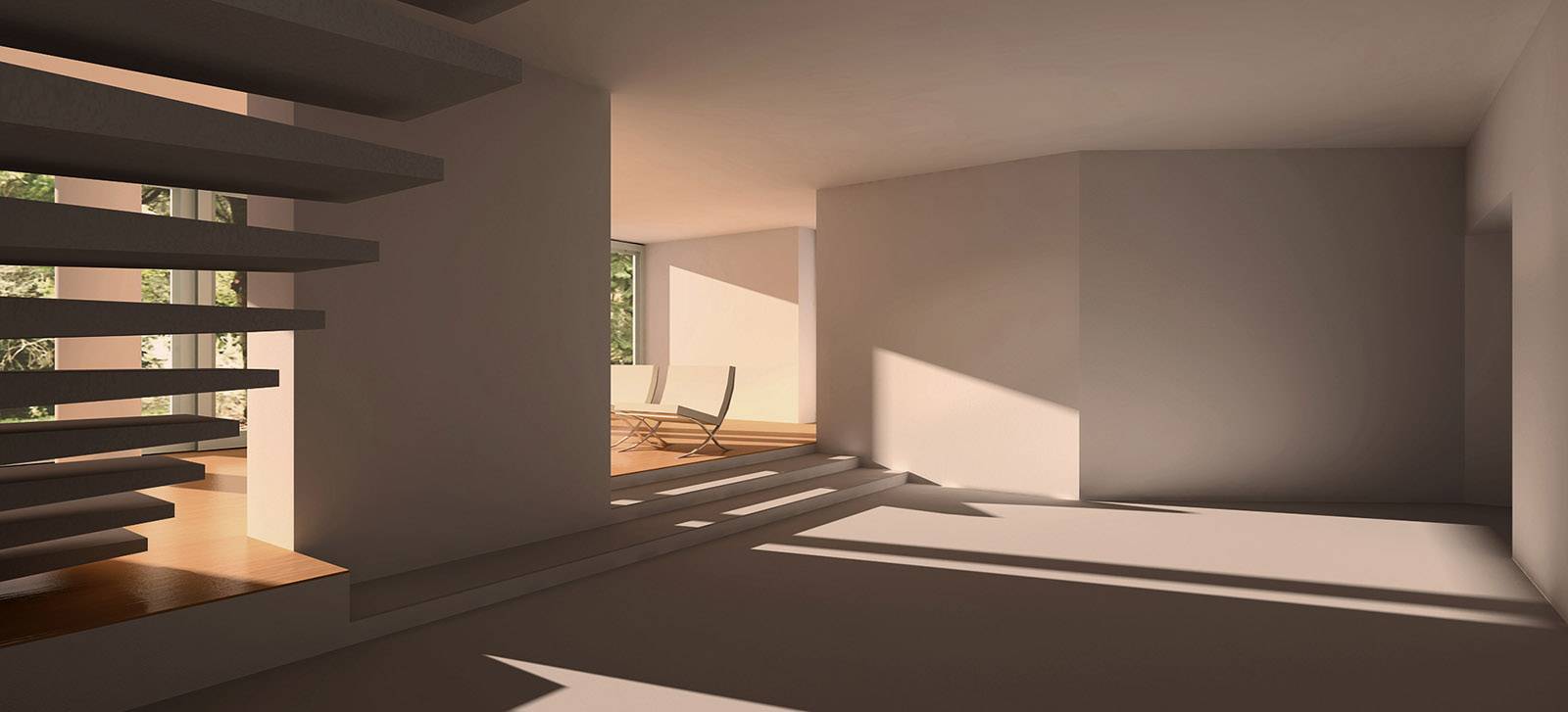
So the entrance becomes concrete in a cavity excavated in the mass of the building, a sort of portico without columns which as well as polarising the pedestrian path of arrival from the grounds, sheltering from rain and sun, connects with the covered part the dwelling with the bedroom for guests. The walls which define the portico in its length do not circumscribe a closed space but run fluidly and divergently, ending in a channel open towards the large room inside the house. But the vision of the drawing room will not be immediate. As in a story, the spatial organism demands its cadences, its events dislocated in time. So, at the end of the channel, the right-hand wall makes an unexpected detour. It redirects the path of the observer, not placing him in front of an end glass wall, but rather along a hypothetical diagonal line from the room which suggests a dynamic perception of the composition. At the same time the bricked surface of the diverted wall creates a dark zone which counterpoints with the glass background. The denial of the background as a static and hierarchical element introduces a dynamic reading of the relationships between architectonic vocabularies, linked according to a dismantled syntax, sensitive to the multiple paths of the user. The square shape (9 x 9 metres) of the drawing room is reinvented by the polygonal progress of the walls and of the openings towards the outside. In plan, at the halfway point three low steps lead to the narrow super elevated rectangle of the living space, thus marking a ‘psychological’ place for meditation and conversation. Three large sliding square panels allow the glass wall to disappear, making it possible to continue activities on the terrace in front. But 'living' the grounds does not imply necessarily using them externally (improbable, apart from anything, in cold months). The internal space will be, yes, a ‘shelter‘, but open to the spectacle of nature and the magic of the light which continually reinvents the architectonic space. The glass background, like a cinema screen, introduces the countryside, so that even simple daily events take on an aesthetic dimension.
The decision to set up the large window facing south-west was determined, apart from structural concerns, by bioclimatic considerations. In winter months, in fact, the sun low in the hemisphere will be ‘hosted’ from midday (south) until sunset (south-west), heating the spaces of the house, reducing energy consumption as a result.
Conversely, in the summer months, the high sun, from midday to early afternoon, will be screened by the covering and, setting, will be eclipsed by the full south-west wall.
The upper floor is reached by means of a staircase which starts from the wooden floor of the living space. This arrangement was determined considering that its use should be ‘mediated‘, guaranteeing intimacy to the upper floor, but also making it accessible without having to cross the bathroom. Airy and constructed from light planes which hover overhanging the brick wall, the ramp then becomes an integral part of the whole architectonic composition. Finally, its departure from the floor of the living space allows a reduction in the number of steps along its length.
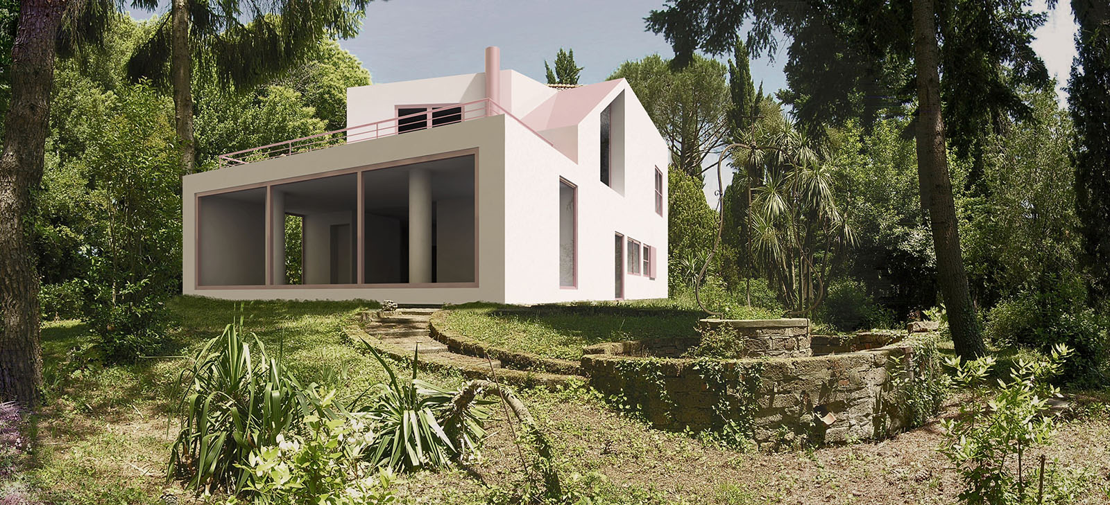
Outside, the large trapezoid window high up on the left pointing south-east describes the cavity that accommodates the stairs. As well as characterising the building from the valley, it will reflect the morning light onto the dining area below. On the floor above a ‘boudoir’ connects three unequal bedrooms, each with its own bathroom. From the main bedroom it is possible to reach the terrace outside.
On the ground floor, apart from the ‘representation’ bathroom, all the workspaces and bathrooms have been incorporated into a single unit. Dislocated between the large room and the reception area, with this unit content and function can be distributed according to a logical and associative network.
From the dining area access to the kitchen is gained through a large sliding panel. The kitchen is connected both to the pantry and the washroom with its own bathroom. The dislocation of all the bathrooms in the house and of the kitchen was determined by the nearness of pre-existing taps and drains, thus eliminating additional costs deriving from the overhaul of the existing plumbing system.
Outside the design aims to configure a unitary, synthetic and powerful mass. The rectangular outline (double squared) in the new building was obtained by means of a partial demolition and a new expansion which absorbs the current portico and its arches. The existing pagoda roof is enclosed by the vertical continuation of the perimetrical walls of the first floor. Its jutting cantilever roof was demolished along with that of the level below that bordered the terrace, in that way eliminating all the gutters from view. The position of the openings and of the windows, lastly, communicates to the outside the contents and functions of the living spaces. The aspect of apparent disorder deriving from it reinforces the anti-perspective three-dimensionality of this new architectonic text.
This text was first published in L’Arca (pdf), no. 224, Milan, April 2007, pp. 53‑55.
Data
- Time: April–July 2005 (design)
- Place: Manziana, Italy
- Area: 270 m² (two storeys)
- Typology: detached house


Credits
- Architecture: Antonino Cardillo
- Clients: Flaminia Barachini, Salvatore Mariconda
- CGI, text: Antonino Cardillo